Okay, on to some buttons I've admired this past week.
I have to be honest, when I spotted this first button, I was just interested in the button. I e-mailed Kristi, the blog's creator. Then after I read her reply, I actually went back to her blog and read it. I'm hooked. Check out The Speckled Dog and you will be too. Here's what Kristi had to say about her button:
"My husband made my blog buttons for me. I told him basically what I wanted and he created them. I wanted something simple that tied in to my blog name (the dots) and I wanted it to stand out. Most other buttons for this type of blog are pastels and sometimes seem to have a lot going on in such a small space. The black and white not only stands out among all of those pastel colors, but it also ties in to my blog name. I've never seen a pastel speckled dog! ha ha!"
This is what Kristi's husband, Charles, had to say about the details:
 "We used Adobe Fireworks. The idea was to use something high contrast to make it 'pop' and instead of confining the content to the borders of the image, to allow the circles to play beyond the boundaries, giving a sense of depth. Most buttons seem 'flat and square' so we tried to break that up a bit. The same idea was applied to the @ symbol but to emphasize 'AT the speckled dog' .. i.e. a web destination."
The Speckled Dog caught my eye because it is a stand out graphic, but this next blog button for Running with Scissors caught my eye because of it's adorable background photo. I wondered what the significance of the picture was, and my momma always told me that it never hurts to ask a question . . . so I did. This is what Jessica had to say about her adorable blog button:
1) What do you like best about your button?
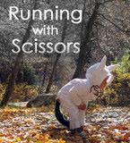 I probably like the photo, it's my son in his Halloween costume for his 2nd Halloween when he was 18months old. He's Max from Where the Wild Things Are. Out of all my photos I've posted on my blog, this one has always been a favorite. I wanted to use a photo from my projects, mainly because I don't have graphic design skills to make an original graphic, but I wanted the button to show something I've made and give you a taste of what you'd see if you chose to click on the button.
 2) Did you craft it yourself or did you commission/inspire someone else to craft it for you? If you crafted it, what program/software did you use?
I edited the photo and added the text using the basic Adobe Photoshop Elements. A friend offered to make it a button and emailed me the code to make it available on my sidebar.
3) What do you think is the most important thing about a blog button?
I like blog buttons that give you an idea of what you would find on the blog, and keep things simple as far as adding a lot of text.
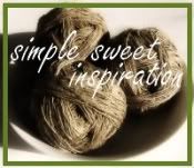
And finally, let's take a look at the button for Simple, Sweet Inspiration authored by AJ. I can't put my finger on it, but something about this button caught my eye. Words that come to mind are clean . . .organic . . . fresh.
1) What is your blog about?
My blog is a mix of mommy blog meets crazy woman blog. I write on themes, memes, post pictures and crafts. I also randomly toss in creative writing in the mix too.1) What is your blog about?
I chose the hemp in the basket because it reflects my obsession with hemp... and the earthy feeling of my life. I am down-to-earth, simple and peaceful... hemp feels that way to me.
3) Did you craft your own button or did you commission/inspire someone else to craft it? If you crafted it, what program/software did you use?I did make my own button, header, layout and all. I use two free programs. Primarily I use Paint.net, but also enjoy using GIMP. Both are free online.
Thanks to AJ, Kristi and Jessica for sharing a bit about your buttons. Go take a look at the blogs behind the buttons to be even more inspired and . . .
craft on!

