For the last few weeks, I've been showing you groupings of buttons that are similar, but this week I have three COMPLETELY different buttons to show off. I am lovin' each one of them for very different reasons.
You'll see why . . .
Life in the Pitts Helena is hilarious! And the button for her hilarious blog, Life in the Pitts, is a great clue that you are in for a wild ride. I saw this button and new that I had to hop on over and check out the blog, and I wasn't disappointed. I laughed and laughed and laughed some more, and she even answers my pretty mundane and boring questions in a way that makes them seem way more fun than they are. Get ready to laugh:
I blog about my life. And my life includes crafts. But it mostly includes friends and family and my super frustrating (but adorable) new husband.
You will like my blog if: you are into laughing.
You will hate my blog if: you are my mother in law.
2) What do you think your button says about your blog? What do you like best about your button?
Huh. I've never thought about this before. Something about the fonts and the spacing just feels right to me. I look at that button and I see myself. And not just because it features an actual photograph of me dancing (true story). In this button every thing's a little crazy, but I'm loving every minute of it. And hey, that's my life.
3) Did you craft your own button or did you commission/inspire someone else to craft it? If you crafted it, what program/software did you use? If someone else did, who?
I made it myself. I took the photograph of myself (which might have been created in Microsoft paint) and cropped it down. Here is the original:
Then I took the cropped picture of me, and uploaded it to Picnik.com. I love Picnik. It's a free online photo editing service owned by Google. I decided to pay the $2.99 (or something) per month, and get the premium features. But you don't have to do that. I resized the image, and then started creating. In the Effects section of Picnik, they have a Vignette option. I used that, and messed around with the color and the intensity until I got it right. That's how the faded border look was created. Then I added the words "Life in the Pitts". Picnik has a ton of fun fonts to choose from, and you decide your own color. I played around with the angles of the words until they looked right. The "a blog" in the upper corner? I faded those letters so that they wouldn't stand out very much. That corner just needed something, but I didn't want it to be distracting. Fading was a good choice (I think, at least). Then I added a 1pxl dark blue border in the frames section, and was done.
Next I saved it. I saved a copy to my computer, but with Picnik you have a ton more options. They can save directly to your facebook, your blog, Picasa, etc. I saved mine directly to photobucket, so all I had to do was get that source code.
4) If you are looking for inspiration, what is the one blog you would turn to?
Ugh. This is hard. I am a huge fan of Kim at 733 - - - A Creative Blog. She is giving my sister a blog makeover right now, and I'm really excited about her ideas. Just looking at her stuff makes me want to start fiddling with my blog!
5) What advice would you give to someone contemplating the creation of their own blog button?
You don't have to get it right the first time. This is version 8 or 9 for me, and I finally have it just how I want it (for now, at least). Keep fiddling and trying new things, and eventually you'll make one you love.
fingerprints on the fridge 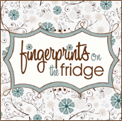 This next button is absolutely adorable. I love the simple color combo - brown and blue and the whimsical and flirty flower design. The other thing that sticks out is the font. Most fonts that are loopy and flowery are hard to read, but I think the word "fingerprints" - even with its loopiness is easy to read and recognize. Love it! I've been following Rachelle and her blog, Fingerprints on the Fridge for a while now, and it seems this blog and its button fit her personality. Here's what Rachelle has to say about her button and her blog:
 This next button is absolutely adorable. I love the simple color combo - brown and blue and the whimsical and flirty flower design. The other thing that sticks out is the font. Most fonts that are loopy and flowery are hard to read, but I think the word "fingerprints" - even with its loopiness is easy to read and recognize. Love it! I've been following Rachelle and her blog, Fingerprints on the Fridge for a while now, and it seems this blog and its button fit her personality. Here's what Rachelle has to say about her button and her blog:
1) How would you describe your blog who hasn't been by to visit yet?
2) Did you craft your button or did you commission someone else to craft it for you? If you crafted it, what program did you use? If someone else did, who?
I had the designers over at Designerblog.com do it for me. I'm far from computer savvy :)
3) What was the inspiration behind your button? What did you want it to say about you or your blog?
I wanted it to be clean and feminine with a little whimsy, and they did it perfectly!
4) What kind of buttons stick out to you when you are poking around in the blog-world?
Clean looking buttons, nice colors, something that pops out as "fun".
5) What inspires you to keep blogging?
I love love love connecting with women! Being home all the time can get lonely and after a while you start to lose your mind. I've met a ton of friends from all over the country that I absolutely adore. Besides that, blogging is an outlet for me, it gives me something to do, helps me finish projects on time and a confidence boost every time someone likes it. Because, who doesn't love hearing someone say your stuff is cute? ;)
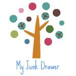 My Junk Drawer Kristen from My Junk Drawer has a super cute and wonderfully simple button that caught my eye right away as I was wandering through blogland. Check out what Kristen has to say about her sweet little button.
 1) What five words would you use to describe your blog?
2) Did you craft your button or did you commission someone else to craft it for you? If you crafted it, what program did you use? If someone else did, who?
I made my button myself. I used picnik to do it. I had to upgrade to get the cute tree but it was well worth it. Picnik is very easy to use for these buttons!!
3) What was the inspiration behind your button? What did you want it to say about you or your blog?
I was inspired to use something that came from the Earth. Something unique but cute. Then I saw that cute tree on Picnik and knew that was it. This tree was actually my second try at a button, the first was a smiley faced flower-cute but not exactly what I wanted. I LOVED the multi-colored "leaves" on it. I think it represents the different things I post.
4) What kind of buttons stick out to you when you are poking around in the blog-world?
The buttons that stick out the most to me are the ones without people pictures. I like the ones that look clean and well made. The buttons I click on the most are either cutesy logos or simple ones like mine.
5) What inspires you to keep blogging?
I am always inspired to keep blogging when I find new cute things that my fellow bloggers have made. I like to post their ideas to show my followers and to store in my labels area to keep for my own future projects. I also love the new friends that I am making. They are all so sweet!!
So get busy checkin' out the blogs behind the buttons and don't forget to say "HI!" to Helena, Rachelle and Kristen during your visit.
Also, hop over to the blog button page and add your button. You may be featured in the coming weeks.
Also, hop over to the blog button page and add your button. You may be featured in the coming weeks.
Craft on!







2 comments:
I'm featuring your gum making recipe at somedaycrafts.blogspot.com. Grab my "featured" button. Thanks for linking up your projects on my blog. Looks like you have a great blog going on here!!!
Thanks so much Elizabeth! :)
Post a Comment